
Ever spot a typeface that you really like and can’t wait to use? It’s exciting, but go slow. Before you buy it, you’ll want to know if the lines, shapes and little doodads that make it so appealing here will work as well as over there. How to tell? Reading a typeface is a little like reading a real face. Tiny differences in the arch of an eyebrow, the curve of a lip and the contour of a cheekbone covey real presence, personality and attitude. These need complementary presence and attitude from the other visual elements, or the result will be awkward, weak or look funny. Here is how to do that:
1. Make a visual overview
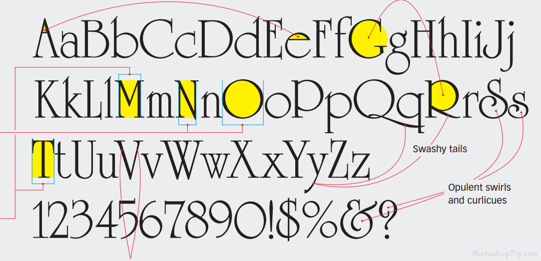
Set the full alphabet and make a visual overview. Write down what you see to make sure you’ve actually seen it. In this sample below, the typeface University Roman was developed in 1983 by the Letraset Type Studio. It’s quirky and popular as a display typeface, especially on greeting cards. It’s good for more than that, as we will see.
We can bring out some comment:
- The letter A and e have extremely small counters or enclosed spaces
- Other letters such ass G, O, R have really big counters
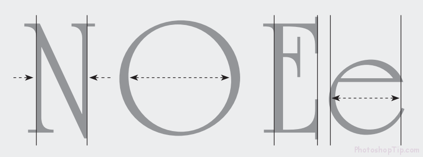
- Characters like N and O that in ordinary alphabets are the same width are very different. Characters like M and T that are normally different are alike here.
2. Look at the details
University Roman is full of swashy idiosyncracies that give it a hand-made, Christmasy style especially suitable for fanciful and romantic topics.
In this example, all straight letters are thin. All round letters are wide. Really wide – so wide that round lowercase letters are wider than their uppercase counterparts!
Wacky x-heights: some have huge tops, some have huge bottoms, no apparent rhyme or reason.
3. Note strengths and weaknesses
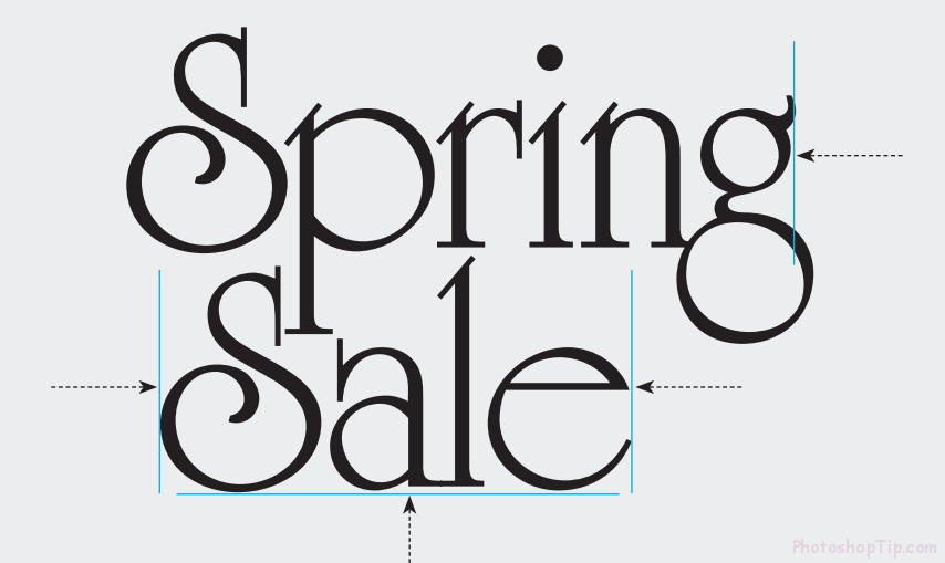
The irregular proportions and embellishments that make the font University Roman have an entertaining display face make it very hard to read in text. Key is to keep it big.
Its irregularities make University Roman unsuitable for text, where a rhythmic, medium typeface works best. University Roman can be used for very brief passages, but for anything more than a sentence or so, use a real text face. University Roman looks best big. Its enormous, round letters create a lot of internal white space that looks better when it’s squeezed out, so set your words tightly and as evenly spaced as possible.
4. Put it to work
The challenge now is to combine type with graphics in a coherent whole. To learn how, let’s start at the end – with a card that illustrate University Roman perfectly turned to its environment.
The lines, shapes and colors of type and image are so tightly intergrated that the designs appear completely natural and unforced. Both type and image are strong but together are greater than the sum of their parts.
5. Look for common shapes
To find an image that goes with your typeface, start with shapes. Round letters go naturally with round images. Avoid triangles, squares and ambiguous shapes, which will compete and weaken your design.
Round shapes are obvious in the round letters, but look at the smaller parts, too – the loops and swirls and negative spaces that are also round. Pair a fancy display face with an ordinary typeface for contrast plus readability at small sizes. Look for similarities. What’s interesting here is how different Futura is from University Roman, yet they have roundness in common.
6. Blend type and image using color and “edge”
Now bring the image into the type, which in this case means literally. Wrap the type around the edge contours, then apply its beautiful gradients to the lettering.
Magenta to yellow and cyan to green are light, fresh combinations. Sample color pairs from the image, add to color palette as gradient swatches, then apply to type, which will take on a natural radiance that blends beautifully into the image. Wrap the words tightly to the contours of the image. As a rule with display type, you’ll do this by eye, paying attention to the nooks, crannies and other details that the software would miss.
7. Lay out the card
Place type and image on the small card, which confines and focuses the design. A small, duplicate image activates the opposite corner and completes the layout.
Splashy composition is beautiful in open space, but its elements must work on a card, which confines them. Set as big as possible, bleeding beyond the lower right corner. A smaller, lighter duplicate image in the upper left activates the passive white and balances the design.








Hello world!
😀 😀👽👽