Inspiration is in everywhere. It possibly an items from quotes on Instagram, a funny story on Facebook, a landing page, an online advertisement, poster or event card. Many designs are inspired from things that we see in daily life.
One of the most basic problem in graphic design is combining text with image. Inserting a memorable phrase into a beautiful picture seems to be a simple thing, but it is also difficult for us to satisfy with the result we obtain. But don’t be worry, along with Photoshop Tip, let’s read the following article below. Thanks to these tips, you will have more skills to apply for your designing project.
Let’s find out right now!
Consider the layout carefully
Position and arrangement of your layout can create a beautiful design or destroy it. If letters are too small, the background looks complex to affect reading, your design will not make any impression and attract viewers. However, text is just a part of the calculus; how to put an image in its right place is important as well. Therefore, you need to pay attention to two these parts:
1. Layout of an image
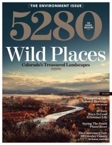
You should take a photo by yourself or search an available source to utilize your design. Your image should be effective and have enough space for you to insert text into. For example, the landscape in the magazine cover below leaves the area of sky which is quite large. Generally, pictures with a big space of sky or a large ocean surface can make a great background for inserting text because it provides transparent space to highlight the text.
2. The whole layout is created by combination of text and image
A design is not perfect when it has just text and image. You probably possess a beautiful picture or a good quote in a nice style, but two these elements need to be combined well together. Otherwise, the result we achieve will not enough attractive to gain attention of views.
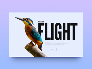
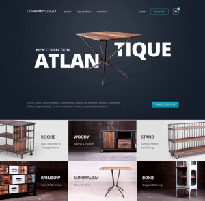
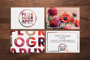
In the place an image and text combine together, you can adjust text suited well to the shape of the object. Pay attention to creative arrangement of the example above. This arrangement shows that design of product is being advertised in the picture. The next arrangement is a net system of images under the heading, text and image of product are arranged harmoniously and make each other remarkable.
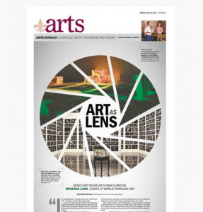
Another way is that you can choose an image to be your background, then insert text on the space above. Two these elements can be combined by different ways, so create freely. For example, the detail text and photo connect directly to the subject by cutting down some space of image to make a special shape related to the topic that text mentions about.
This is a characteristic of cutting image, so the space of image will present content of text as you can see in the design below:
In next part we will tell you more rules in creating an attractive layout and how to get inspiration for your design. See you next time!

