Text effects in Photoshop are varied depending on designers. This post recommends a beautiful 3D effect for your reference.
Firstly open Photoshop and create a new project, write the text that needs effect.
Step 1
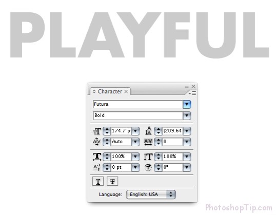
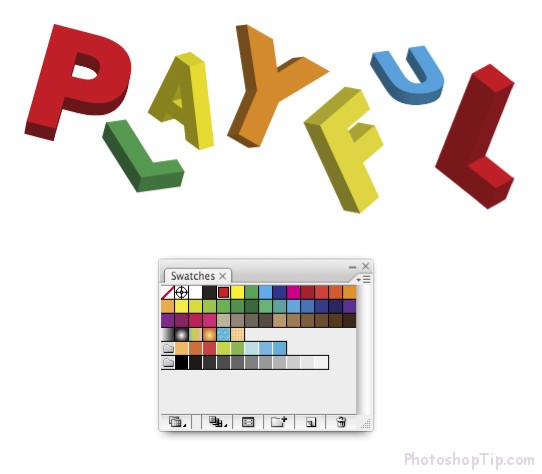
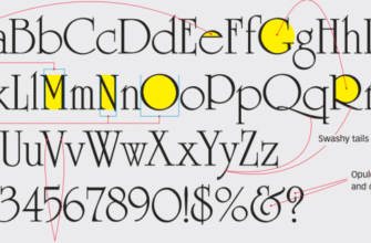
It’s better to choose reasonable fonts, for example:
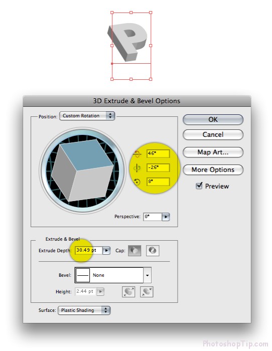
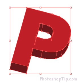
Step 2: Choose Effect > 3D > Extrude & Bevel… Key in variables where was marked as below
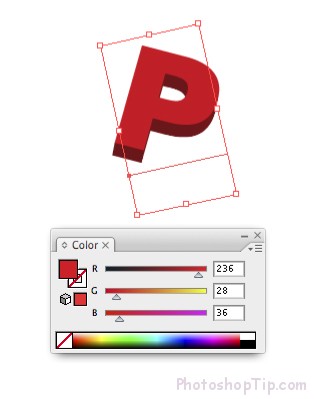
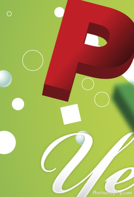
Step 3: Even when you’ve done 3D effect, you can turn characters to whatever Angle you like, as I did to below image. You just need to use Selection Tool (V) to turn the characters. Click onto a color and the 3D shade will automatically appear in different faces of the character.
Step 4:
Use similar technique to other characters. Use Palette Swatches to quickly select a lively color and attach to each character.
Step 5
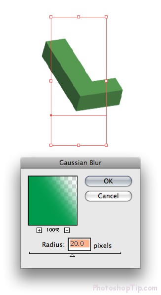
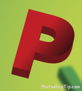
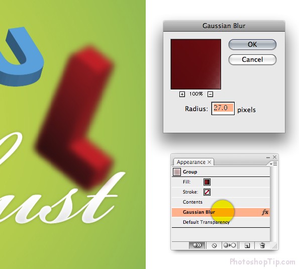
Create depth of Field (surface of Object at long and short sights) by choosing Effect > Blur > Gaussian Blur…Key in variables as below and click OK. Warning: Make sure your characters will not have larger nor smaller scale after you attach Blur, ‘cause Blur does not allow scale even though you designed it in Adobe Illustrator.
Step 6
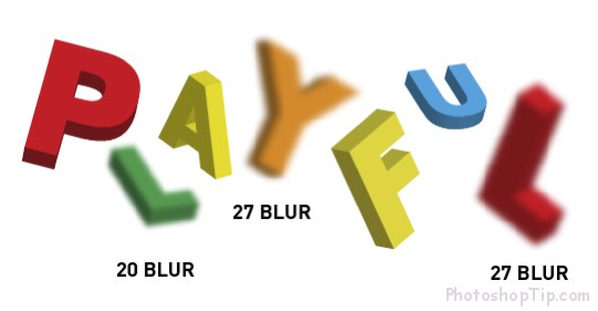
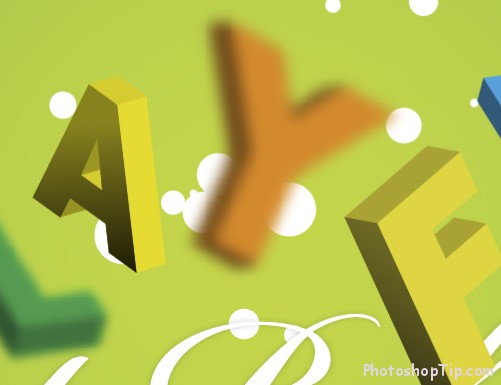
To create a wider range, you can give the characters an unique Blur Amount. Look thoroughly to feel Angle, Scale, Blur and the color of all factors in the whole text. Each character has its random quality. Scale is very different in terms of proposed distance. Once again, Blur strengthens the depth and the color of the text will be bright and not repeat for those standing side by side.
Step 7
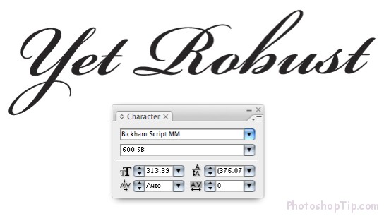
Key in the rest of the clause. The font in use is Bickham Script. As you can see, this font is very different from the fonts in the word “Playful” above. This will make a range and an unique contrast between 2 words. Do the same with your layout.
Step 8
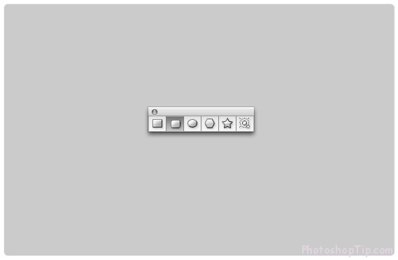
Use Rounded Rectangle Tool to draw a rectangular as in below image. Note: you can adjust the curve of the angle by holding the arrow up and down while drawing the rectangular.
Step 9
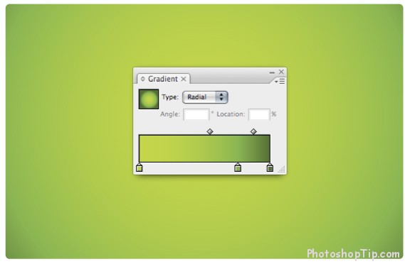
Fill the rectangular with 3 gradient points. The right side – almost all the green color will make a darker green color and thus form the frame for the rectangular.
Step 10
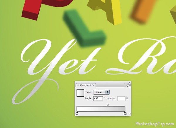
Move text onto background. To attach a gradient to text, you’ll firstly have to move it into drafts. Choose Type > Create Outlines. Now choose text and give a refined grey color to the while gradient.
Step 11
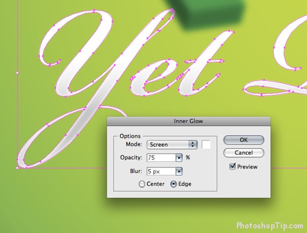
To make the text more like 3D, add an Inner Glow by choosing Effect > Stylize > Inner Glow… Select Screen, in Mode drop down. Key in Opacity around 75 and set up Bluras you like.
Step 12
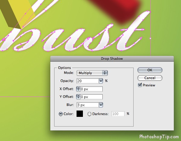
Now the character looks a bit round, we shall move on to next steps and add a Drop Shadow…Set up Mode to Multiply (to get shadow mixed uniquely with the background). Set up your Opacity down to around 20 and give it a Blur as you choose.
Step 13
This is all that your design progress gets till now.
Step 14
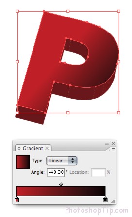
We will upgrade the surface of each character by adding gradients. Make a copy of the character at first. Choose the copy and come to Object > Ungroup. Continue Ungroup object until you can choose the surface of the object.
Step 15
Choose the surface of the character and give it a red – black gradient.
Step 16
You can erase the remainings of the character that are not applied with gradient. Put the surface of the character above the characters with 3D effects attached thereto.
Step 17
Use similar techniques to make depth to other characters when needed. For places where characters are blurred, you can just apply Blur to that character surface. To see how much the character is blurred, double click on that effect in Appearance Palette.
Step 18
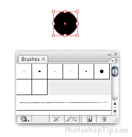
in this step, we will give into the background a random circle. Use Ellipse Tool (L)to draw an inner circle. In terms of the purpose of this guideline, we use a black circle, however yours can be white or any color you like. Drag the circle into Brushes Palette. Text boxes will be open in following steps …
Step 19
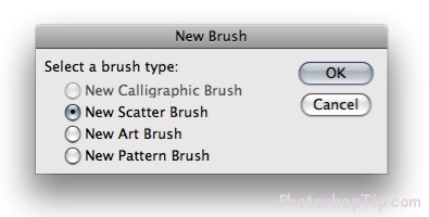
Choose New Scatter Brush and click OK …
Step 20
Choose size, space and random Scatter, drag small triangles to the sides of the slider in all 3 choices. This will make sure the circle is varied and does not repeat too much. Click OK.
Step 21
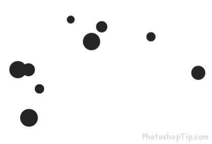
In Palette Brushes, choose brush the circle you’ve just made. Choose Paintbrush Tool (B) and draw a Line. Your Line will be repeated with a circle similar to the lower one. If your inner circles are not random as you expect, you just need to double click onto the circle in Brushes Palette to change parameters.
Step 22
Put the circles on their own layers behind the characters. Draw more Line as you wish or copy and paste other circles to set up a big circle systems.
Step 23
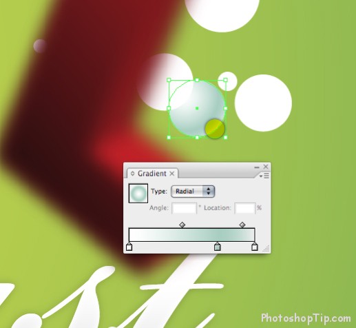
Use Ellipse Tool to draw a circle and use a Radia filled with 3 gradient points. This way allows you to make an outstanding detail outside the circle to make it more realistic. Copy and Paste this circle some times in layout.
Step 24
You can make other Brush by using other shapes such as square, triangle and draft versions of each shape will bring back with many interesting things.
Step 25
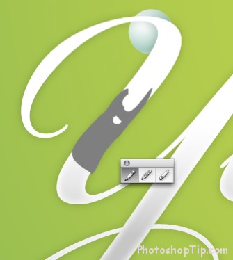
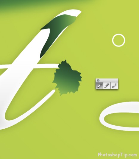
Use Pencil Tool (N) to draw some scattered shapes, it will function as moss or feral in characters.
when you draw with Pencil Tool, it will be a bit difficult to make the shape tight. The easiest way to tight such shapes is to hold Option button when you get near to the start point of the shape. The shape will be automatically tightened in this way.
Step 26
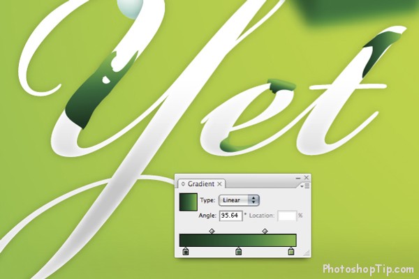
Add more shapes and give them a gradient from green to dark green.
Step 27
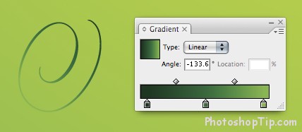
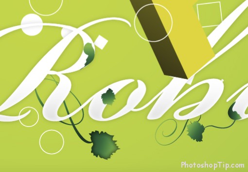
To make a vine, you can just use a character, which belongs to Bickham Script font, instead. If your font does not have such replacement character, you can try using parts of other characters, like S. otherwise you will have to draw some twisted shapes, in the classical way… by using Wacom Tablet and Pen Tool.
Step 28
Make a leaf in the same way that you use to make moss shapes. You’ll get better results if you practise more
Step 29
To widen the surface of the leaf, give in an Inner Glow by choosing Effect > Stylize > Inner Glow…
Step 30
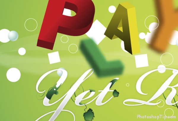
This is what our layout has till now.
Step 31
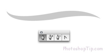
We’ll give the background a little movement by using Pen Tool (P) to draw a similar shape as below
Step 32
Copy this shape once or twice and adjust Opacity to reduce the surface of the image. Add more fragile, dim shapes to create swirling illusion.
Step 33
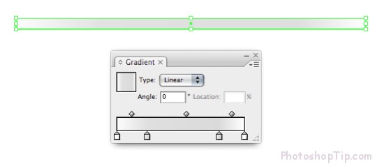
Use Rectangle Tool to draw a rectangular and give in 4 gradient points with white color at all ends.
Step 34
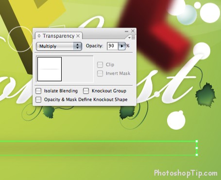
Put gradient above the background and blur it. In Transparency Palette, set up the shape into Multiply, so that it’s mixed well with the background. Adjust Opacityas you like if you find it necessary.
Final image
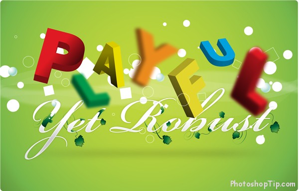
This is the image of the work we’ve made. You have completed the design of Vector 3D Text. Congratulations!

