It’s easy to enhance an average design for a great component with just the right colors. On the other hand, looking at a color wheel with a lot of possibilities, creating a palette, even with just two colors, can be really scary.
Simple

Cocacoca logo is very simple with red color
Simple logos are always appreciated, you can see famous brands, Samsung, IBM, Coca Cola,… They seem to only use the brand name as the enclosed logo, they use only the application simplicity consists of two colors but bring out great effects.
Just simple, you can make your logo more memorable than the others and that is the first step for brand success.
Fit the whole

Adidas logos are simple and active
Of course, the logo needs to be in harmony with your brand, because the customer can see the logo that you designed to implicitly predict the message you want to target, the product or service that you offers and style of your own business.
Typically, Adidas – their logo is just three straight vertical stripes, the image they want to target is the same, the sporty young, active and liberal, their logo has achieved this requirement.
Easy to remember

The Pepsi logo is very memorable
Most of the logos of successful brands are very easy to remember, you can browse through some brand names such as Nike, Coca Cola, Pepsi, IBM, Microsoft,… They are not too picky but there are points for customers can remember. Especially, they are very simple, which helps their logo can go deep into the minds of customers.
Easy to remember does not mean that they will become popular and use popular images, they need to be a highlight for customers to pay more attention to them and from there to become a memorable point in your logo.
If Apple did not use the apple scale that they are intact, maybe their logo is not often referred to customers. Since the appearance, they give customers the novelty and impression with a picture apple scale.
Impressive
It is difficult to find a logo that is both impressive and simple yet memorable because it seems too difficult to meet all criteria.
So, the impressive logos do not carry a perfect things. However, if your business is new, needs some freshness and innovation, needs attention from the community and users, this can take a risky adventure for you to use.
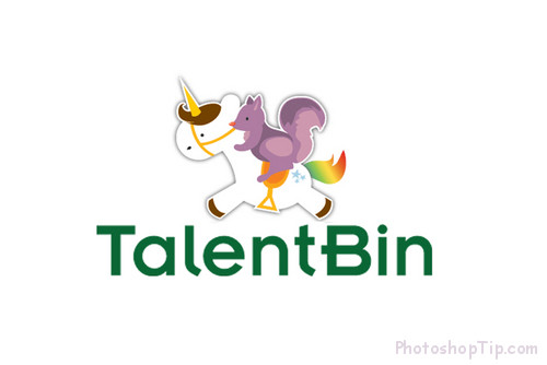
Sometimes, to make an impression you have to leave the usual logic and TalentBin is a typical example. Their logo really impressed with the purple squirrel riding a carnival.
However, their meaning persuades people, unicorn to show TalentBin and squirrels are the candidates they find, which are truly outstanding and hard to find candidates. TalentBin has done the thing, so your business should also use their job search service.
Satisfy market survey requirements
No matter how satisfied you are with your logo, you also need to be accepted by the market, and the survey is an important step you should take before launching the official logo for your business.
If you will go into your subjectivity, your hunch may be wrong compared to the crowd out there. If you can take a survey sample is large, you can diagnose properly tastes of customers.


